Xamarin Forms - Change a Switch's True/False Colour
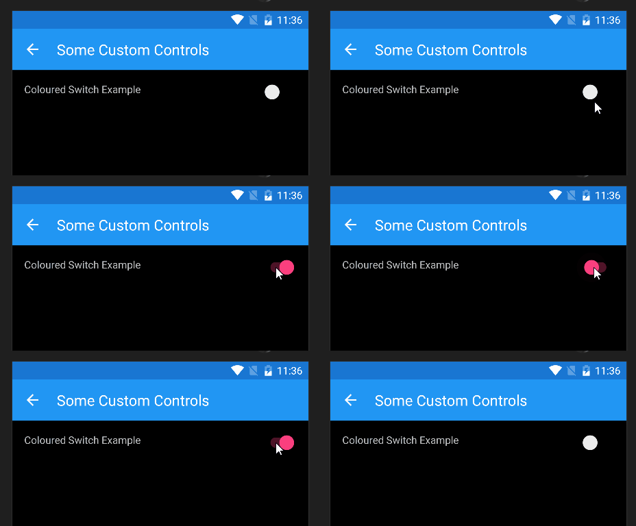
In a similar vein to my previous post, I recently had to set the colour for a Xamarin Forms Switch’s true/false colour to something other than the default, on Android. The colour scheme for the app meant that on Android, the default false colour caused the Switch’s track to blend into the background, making it look like a circle floating in the middle of nowhere:

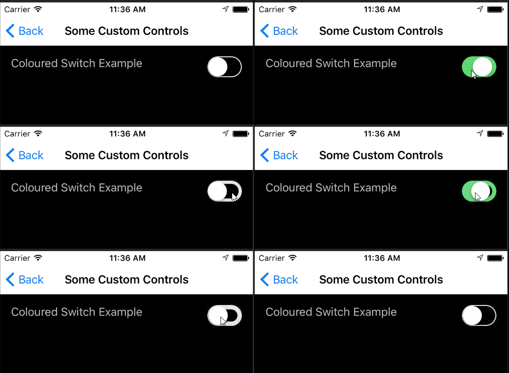
iOS, of course, was fine:

Switching Colours Using an Effect
Rather than use a custom renderer for this one, I thought it could better be handled as an effect, and a bit of googling and stack-overflowing bore this out. There’s some very good examples of effects at the Xamarin Forms Community Toolkit.
The switch-colour effect example they have there got me close, but wasn’t quite enough to seal the deal, but I’ll get to that shortly.
The Xamarin Forms switch-colour effect is pretty simple. It uses a basic Effect ‘skeleton’ and adds three bindable properties to it, a TrueColorProperty, a FalseColorProperty and a ThumbColorProperty. The last one enables us to set the colour of the actual ‘thumb-slider’ component of the switch control, whereas the true and false colours are for the ‘track’ within which the slider sits.
Here’s the code for the Xamarin Forms abstract ChangeColorSwitchEffect. Nothing special, just those bindable properties, some getters and setters for them, and attachment/detachment code for when the Switch control is bound at runtime.
public static class ChangeColorSwitchEffect
{
    public static readonly BindableProperty FalseColorProperty = BindableProperty.CreateAttached("FalseColor",
                                                                    typeof(Color),
                                                                    typeof(ChangeColorSwitchEffect),
                                                                    Color.Transparent,
                                                                    propertyChanged: OnColorChanged);

    // removed TrueColorProperty and ThumbColorProperty declarations


    private static void OnColorChanged(BindableObject bindable, object oldValue, object newValue)
    {
        var control = bindable as Switch;
        if (control == null)
            return;

        var color = (Color) newValue;

        var attachedEffect = control.Effects.FirstOrDefault(e => e is ChangeColorSwitchEffect);
        if (color != Color.Transparent && attachedEffect == null)
            control.Effects.Add(new ChangeColorSwitchEffect());
        else if (color == Color.Transparent && attachedEffect != null)
            control.Effects.Remove(attachedEffect);
    }

    public static Color GetFalseColor(BindableObject view)
    {
        return (Color) view.GetValue(FalseColorProperty);
    }

    public static void SetFalseColor(BindableObject view, string color)
    {
        view.SetValue(FalseColorProperty, color);
    }

    // removed Get/SetTrueColor method


    // removed Get/SetThumbColor method


}
For the sake of brevity, I’ve removed some of the duplicate-looking stuff. The fully working example is linked at the end of this post.
XAML Implementation
Now just define a switch as you normally would, and then add values for the BindableProperties you defined above:
<StackLayout HorizontalOptions="FillAndExpand" VerticalOptions="FillAndExpand"
              Orientation="Vertical"
              Padding="16" Spacing="32">

    <StackLayout VerticalOptions="StartAndExpand"
                  HorizontalOptions="FillAndExpand"
                  Orientation="Horizontal"
                  Padding="0" Spacing="16">

        <Label TextColor="Silver"
                Text="Coloured Switch Example"
                HorizontalOptions="StartAndExpand"
                HorizontalTextAlignment="Start" />

        <Switch VerticalOptions="StartAndExpand"
                HorizontalOptions="EndAndExpand"
                IsToggled="False"
                effects:ChangeColorSwitchEffect.TrueColor="Lime"
                effects:ChangeColorSwitchEffect.FalseColor="Aqua"
                effects:ChangeColorSwitchEffect.ThumbColor="Blue"
        />
</StackLayout>
Those colours will be a little garish. But as you’ll see, they make it pretty clear what we’ve done in the platform-specific effect implementations. So let’s have a look at those next.
Android Implementation
I’ve left out some of the usings declarations and the effect-export stuff to keep this shorter.
public class ChangeColorSwitchEffect : PlatformEffect
{
  private Color _trueColor;
  private Color _falseColor;
  private Color _thumbColor;

  // tracks are slightly darker for some 'virtual depth'


  private Color _falseColorDarker;
  private Color _trueColorDarker;

  protected override void OnAttached()
  {
    if (Android.OS.Build.VERSION.SdkInt >= Android.OS.BuildVersionCodes.JellyBean)
    {
      _thumbColor = (Color)Element.GetValue(XECCSwitchEffect.ThumbColorProperty);
      _trueColor = (Color)Element.GetValue(XECCSwitchEffect.TrueColorProperty);
      _falseColor = (Color)Element.GetValue(XECCSwitchEffect.FalseColorProperty);

      _falseColorDarker = _falseColor.AddLuminosity(-0.25);
      _trueColorDarker = _trueColor.AddLuminosity(-0.25);

      ((SwitchCompat)Control).CheckedChange += OnCheckedChange;

      ((SwitchCompat)Control).TrackDrawable.SetColorFilter(_falseColorDarker.ToAndroid(),
                                                           PorterDuff.Mode.Multiply);

      ((SwitchCompat)Control).ThumbDrawable.SetColorFilter(_thumbColor.ToAndroid(),
                                                           PorterDuff.Mode.Multiply);
    }
  }

  private void OnCheckedChange(object sender, CompoundButton.CheckedChangeEventArgs checkedChangeEventArgs)
  {
    if (checkedChangeEventArgs.IsChecked)
    {
      ((SwitchCompat)Control).TrackDrawable.SetColorFilter(_trueColorDarker.ToAndroid(),
                                                           PorterDuff.Mode.Multiply);
    }
    else
    {
      ((SwitchCompat)Control).TrackDrawable.SetColorFilter(_falseColorDarker.ToAndroid(),
                                                           PorterDuff.Mode.Multiply);
    }
  }

  protected override void OnDetached()
  {
    if (Android.OS.Build.VERSION.SdkInt >= Android.OS.BuildVersionCodes.JellyBean)
    {
      ((Switch)Control).CheckedChange -= OnCheckedChange;
    }
  }
}
A couple of points:
- On Android, if you make the track and thumb colours the same, it doesn’t come out quite like you expect. It looks flat and undifferentiated, because the track has no ‘depth’ beneath the thumb-slider. So I’ve made the track a little darker than the thumb slider by reducing the luminosity (‘brightness’) by 25%.
- The example project shows a few extra things you can do with the the thumb-colour, for instance changing the thumb-colour depending on the state of the switch.
- Yes, I know I could have used the newer
Statearray stuff to set tint/hint colours on Android, but this is backwardly compatible, AND enables one to change the colour of the thumb-slider based on the switch-state.
iOS Implementation
public class ChangeColorSwitchEffect : PlatformEffect
{
  private Color _trueColor;
  private Color _falseColor;
  private Color _thumbColor;

  protected override void OnAttached()
  {
    _trueColor = (Color)Element.GetValue(XECCSwitchEffect.TrueColorProperty);
    _falseColor = (Color)Element.GetValue(XECCSwitchEffect.FalseColorProperty);
    _thumbColor = (Color)Element.GetValue(XECCSwitchEffect.ThumbColorProperty);

    var switchControl = Control as UISwitch;
    if (switchControl != null)
    {
      switchControl.TintColor = UIColor.FromRGBA((nfloat)_falseColor.R,
                                                 (nfloat)_falseColor.G,
                                                 (nfloat)_falseColor.B,
                                                 0.75f);
      // see example code for caveat about changing background colour...


      switchControl.OnTintColor = UIColor.FromRGBA((nfloat)_trueColor.R,
                                                   (nfloat)_trueColor.G,
                                                   (nfloat)_trueColor.B,
                                                   0.75f);

      switchControl.ThumbTintColor = UIColor.FromRGBA((nfloat)_thumbColor.R,
                                                      (nfloat)_thumbColor.G,
                                                      (nfloat)_thumbColor.B,
                                                      1.0f);
    }
  }

  protected override void OnDetached()
  {
  }
}- If you want to change the background colour of the switch, then you need to set a corner-radius on the UISwitch layout, or it draws the component with squared-off corners. See the example code for how to do this.
- Unfortunately on iOS it’s not easy to change the thumb-slider colour depending on the switch-state
- Similarly to Android, I made the track colours (
TintColoris ‘off’ or ‘false’,OnTintColoris ‘on’ or ‘true’) a bit dimmer, by 25%. One wonders why they didn’t call itOffTintColor…
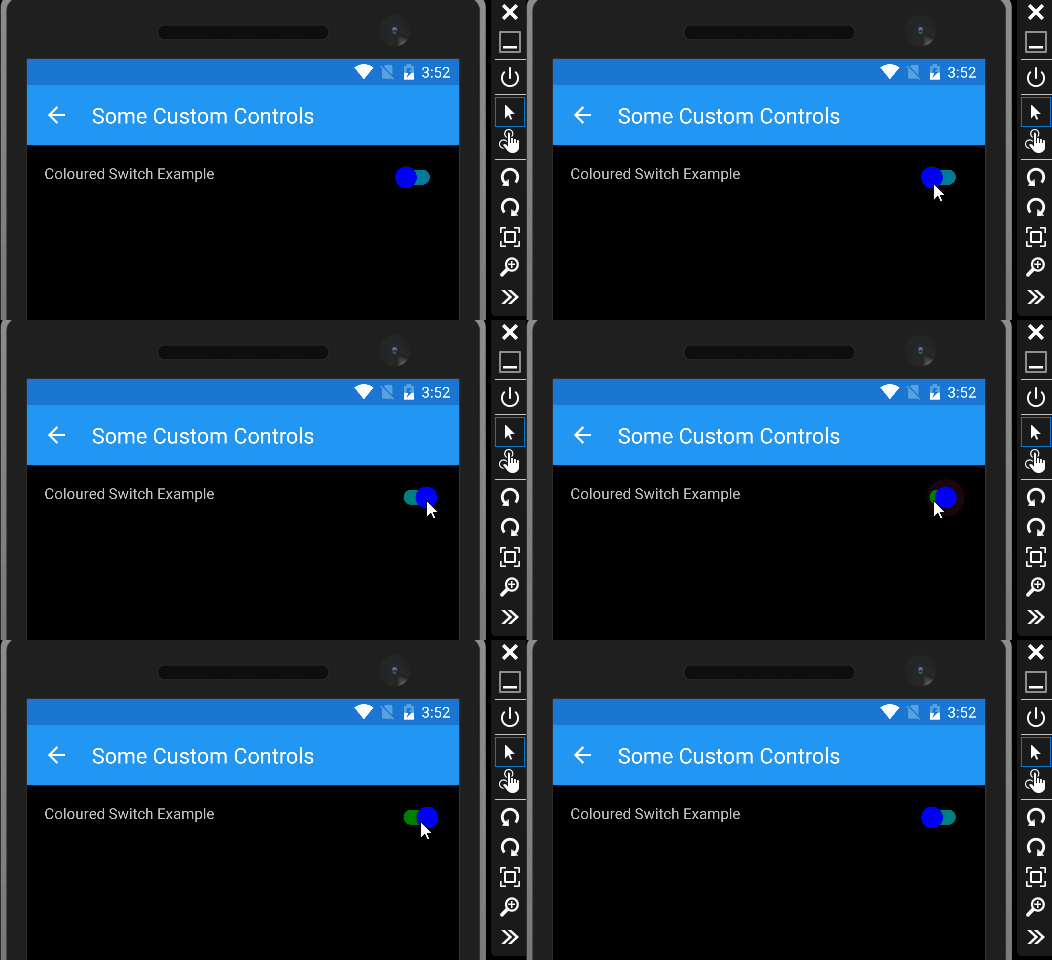
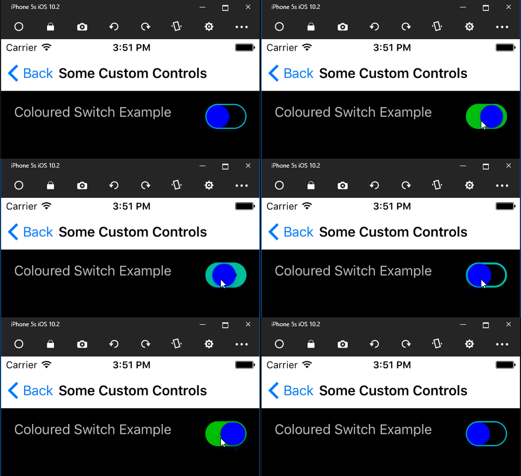
So how does it look?
On Android

On iOS

There’s a simple Xamarin Forms project over in GitHub so you can try it out for yourself. As usual it’s published under the MIT licence, so you can do what you like with the code. Hopefully it can save you some time, or get you where you need to be ;)